Motion Design / Trend Research
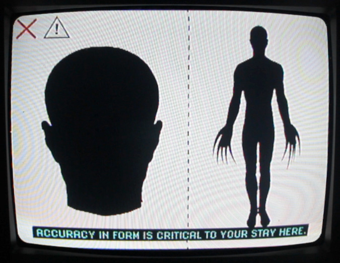
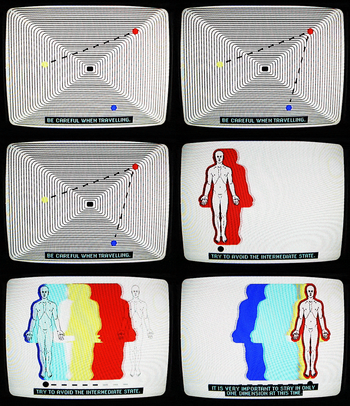
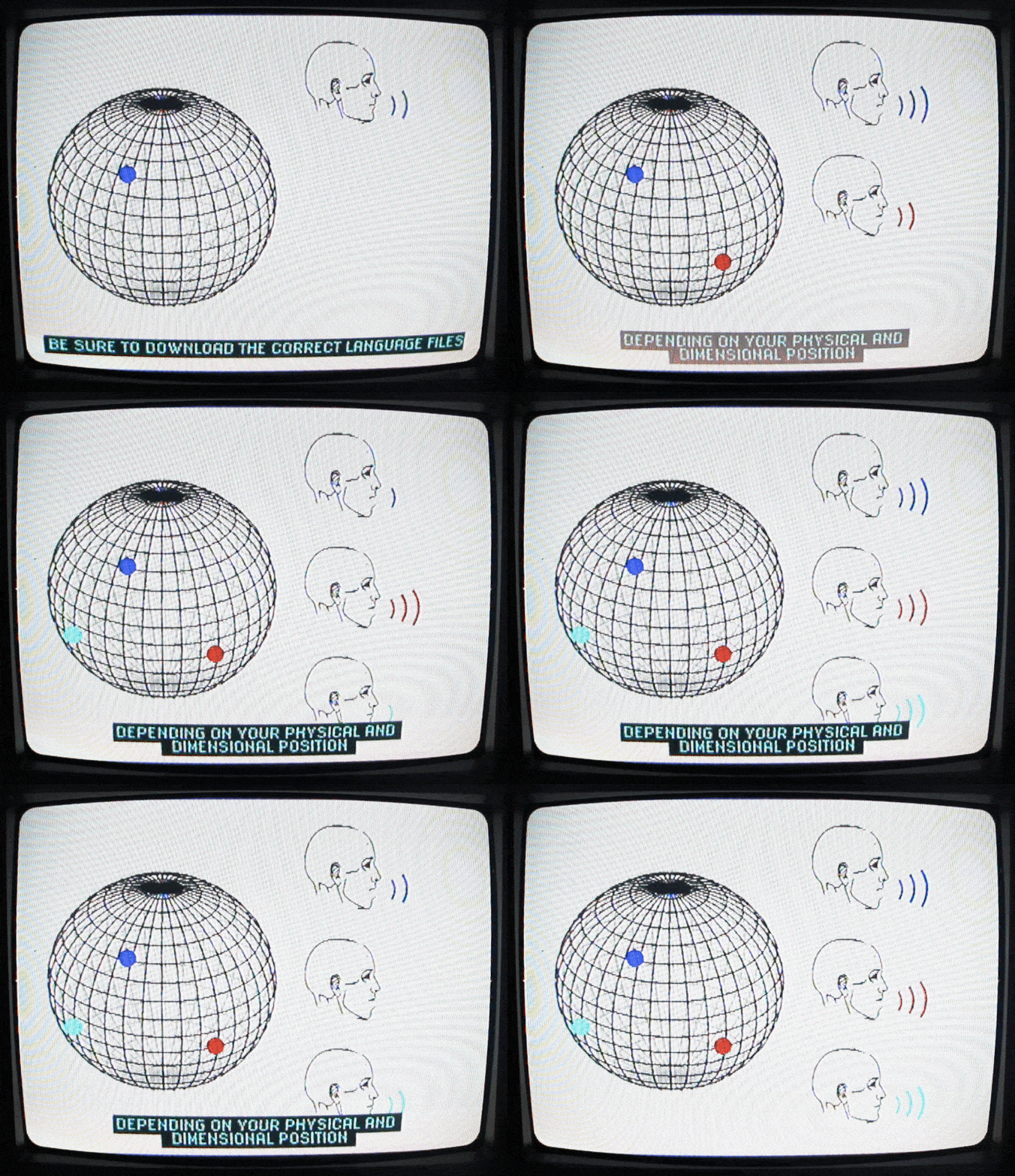
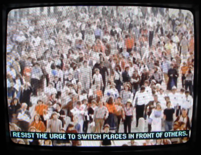
Spectrum Corp: 15ӜSXЉ Diversion is a fictional training video detailing how to be a human [being], for non-human [beings].
This work is in the style of
analog horror,
a subgenre of internet horror.DELIVERABLES
︎ One 3-minute video
︎ Branding/logo
︎ A set of DVDs placed in the wild
︎ Two research posters
︎ A live exhibition setup
︎ Branding/logo
︎ A set of DVDs placed in the wild
︎ Two research posters
︎ A live exhibition setup
GOALS AND INTENT
︎ Question what is means to be human in a shared reality
︎ Tread the unsettling
︎ Create strange art
︎ Contribute to & study an interesting subgenre
︎ Analyze the role of internet horror in modern society
︎ Tread the unsettling
︎ Create strange art
︎ Contribute to & study an interesting subgenre
︎ Analyze the role of internet horror in modern society
INTRODUCTION
An interesting part of this project is its intended audience. Guess what? It’s you. It’s real people.
The intended audience is purposefully opposite from the audience it appears to be for -[non-humans]. It’s meant to reframe human mannerisms to the point of strangeness, in order to connect us with our humanness & each other, while distancing us from that humanness simultaneously.
Analog Horror is commonly characterized by low-fidelity graphics, cryptic messages, and visual styles reminiscent of late 20th-century television and analog recordings. Analog horror works are typically set between the 1960s - 1990s.

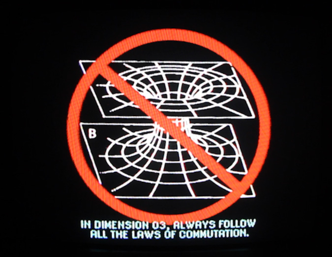
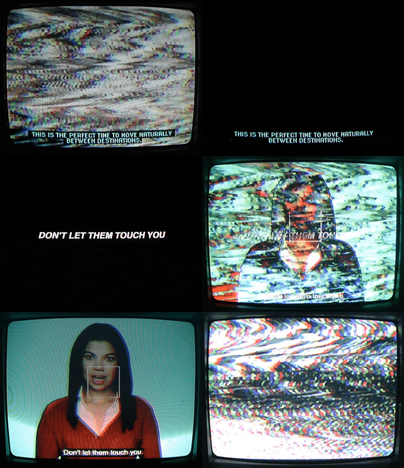

Analog Horror examples & inspo:
click me︎︎︎
 The Mandela Catalogue,
Alex Kister, 2022
The Kid and The Camera, Braiden Oritz, 2023
 Great Choice,
Robin Comisar, 2017
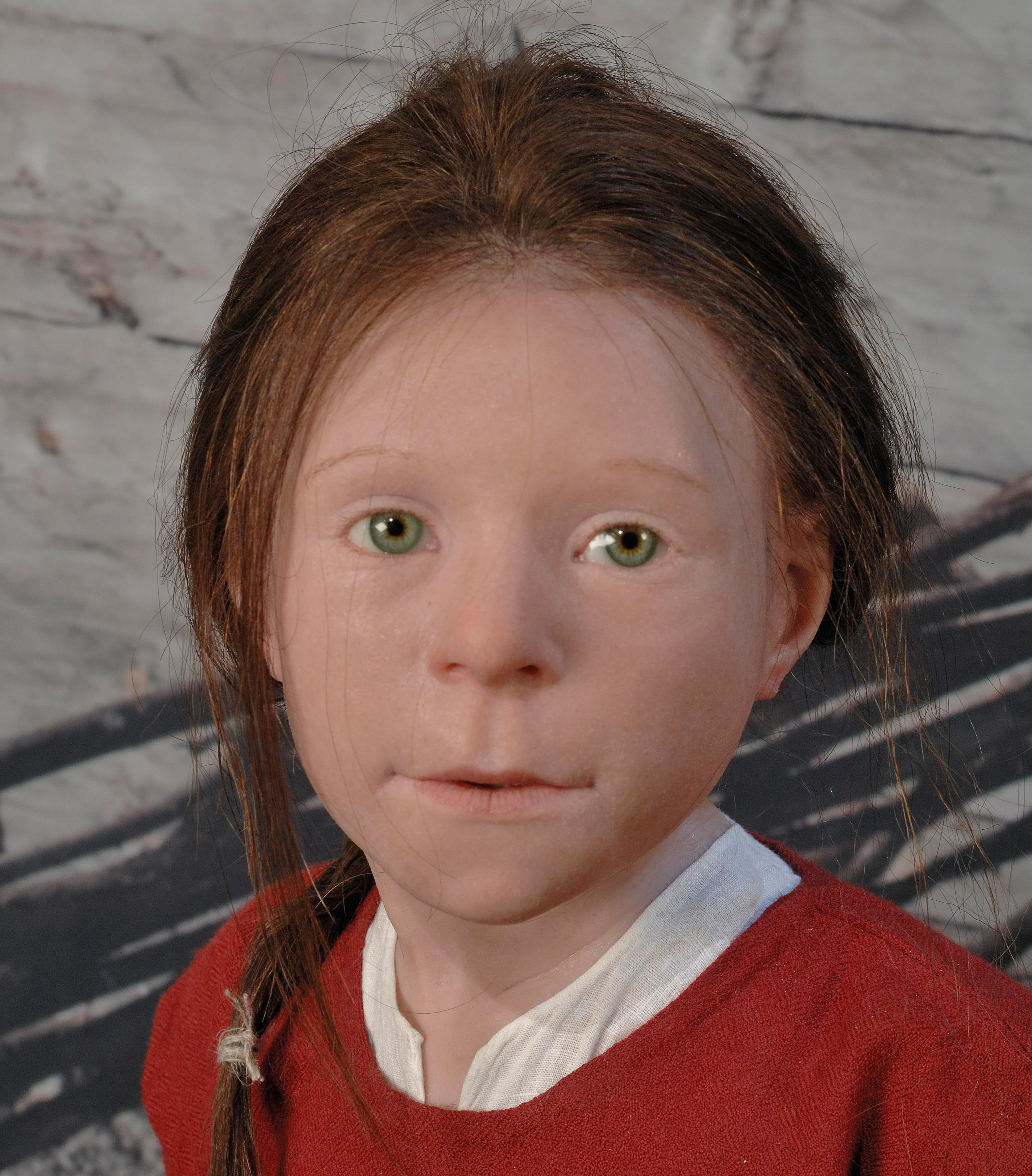
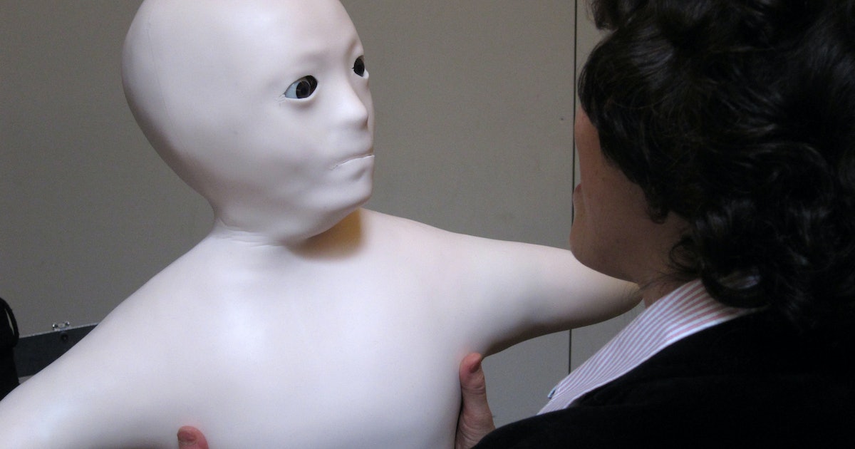
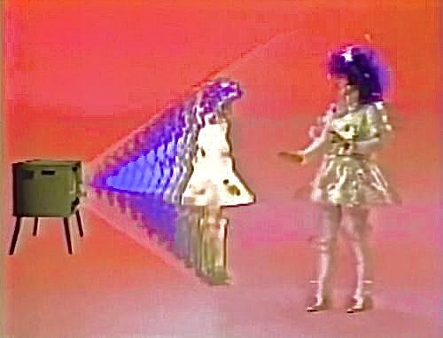
This project is heavily influenced by the uncanny valley.
In aesthetics, the uncanny valley is a hypothesized relation between an object's degree of resemblance to a human being and the emotional response to the object.
The concept suggests that humanoid objects that imperfectly resemble actual human beings provoke uncanny or strangely familiar feelings of uneasiness and revulsion in observers.
![]() I Feel Fantastic,
John Bergeron, 2004
I Feel Fantastic,
John Bergeron, 2004
![]() You Could Stop at Five or
Six Stores, Unknown Creator, Unknown Date
You Could Stop at Five or
Six Stores, Unknown Creator, Unknown Date
Notable examples and influences:
click me︎︎︎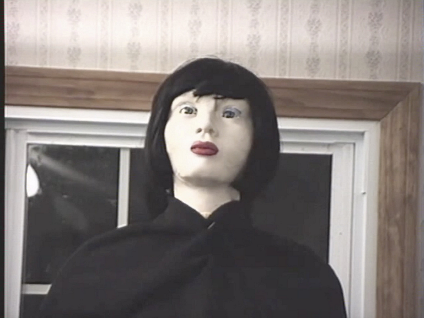 I Feel Fantastic,
John Bergeron, 2004
 You Could Stop at Five or
Six Stores, Unknown Creator, Unknown Date


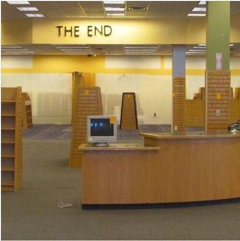
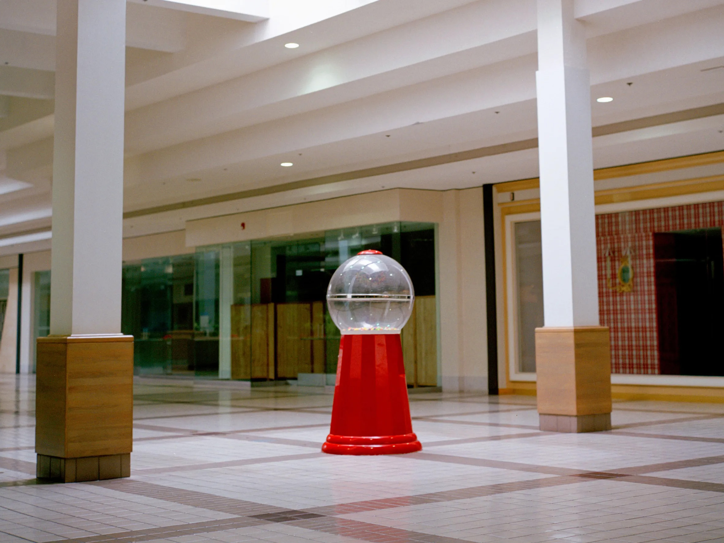
This project is heavily influenced by liminal spaces.
LIMINAL: adjective TECHNICAL
1. occupying a position at, or on both sides of, a boundary or threshold. "I was in the liminal space between past and present" 2. relating to a transitional or initial stage of a process. "that liminal period when a child is old enough to begin following basic rules but is still too young to do so consistently"
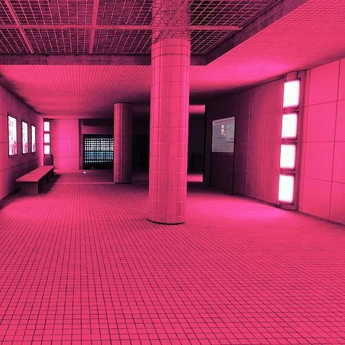
Liminal spaces have become much more than their technical definition. It has now reached status as an internet aesthetic, becoming fairly popular online in recent years.
Often times, these spaces call to a childlike yet unsettling energy. Liminal spaces can be rendered, like the “Backrooms” series, or organically photographed.

SPECTRUM AESTHETICS
LOGO & BRAND


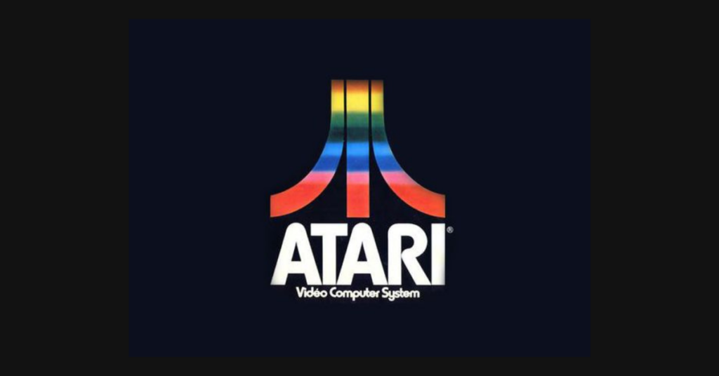
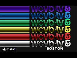
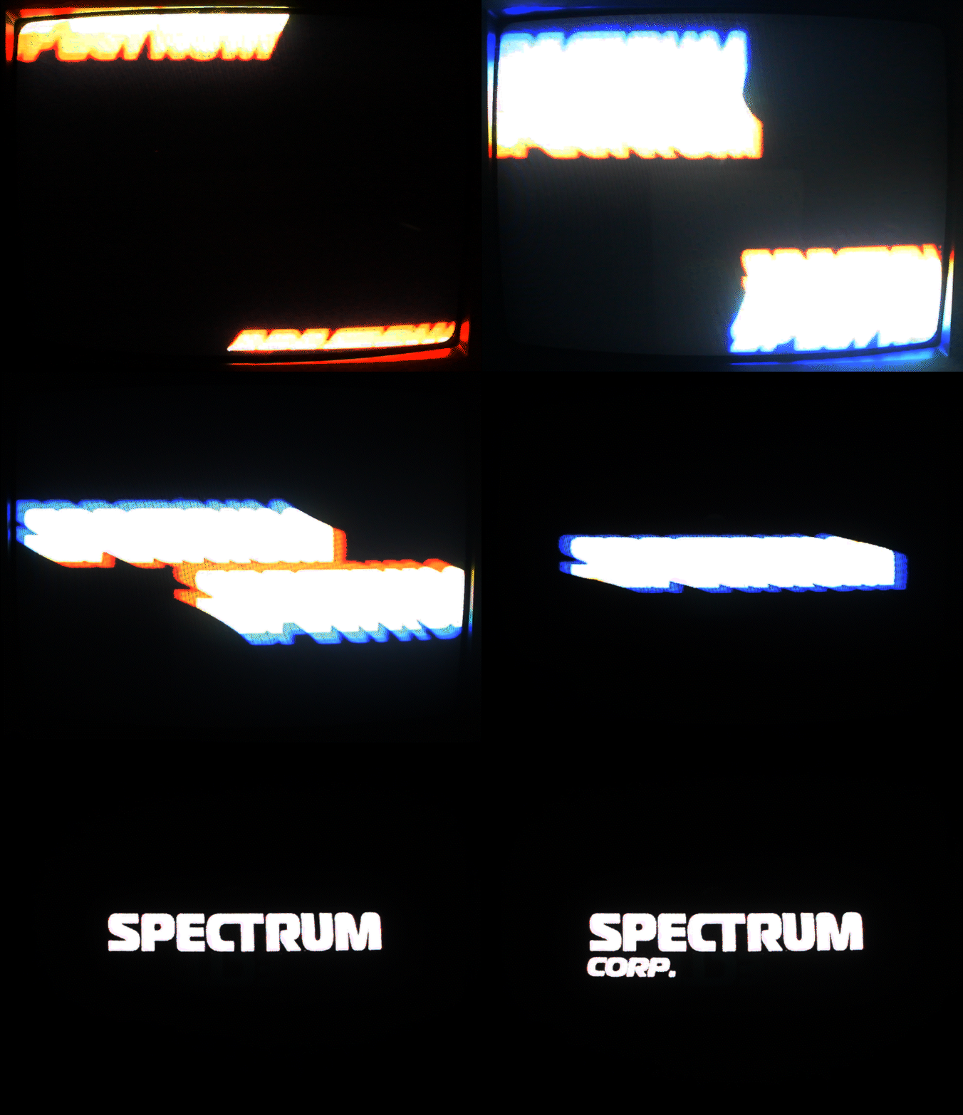
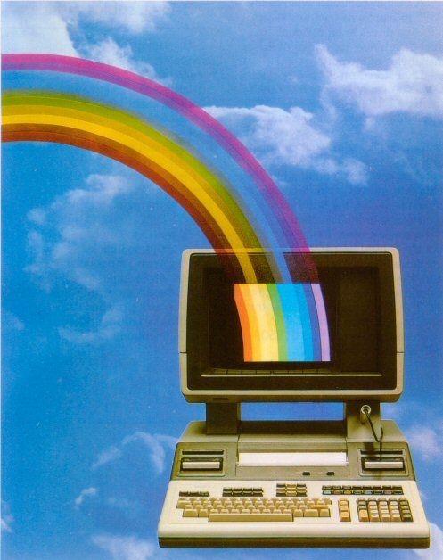
The Spectrum Corp. logo is a direct ode [parody?] of 1970s-1980s logo animations- primarily the overused -yet iconic- rainbow motif. “Spectrum” itself is named after this trope.

ICONOGRAPHY


Iconography was kept simple and [assumed] to be immediately understandable.
Keep in mind, however, the subtle differences that non-human beings may not catch.
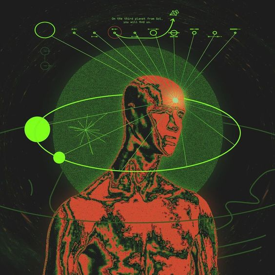
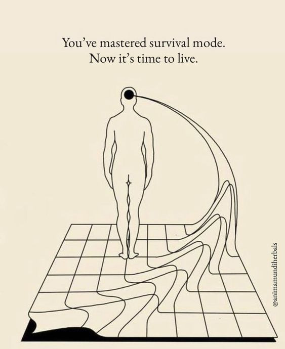
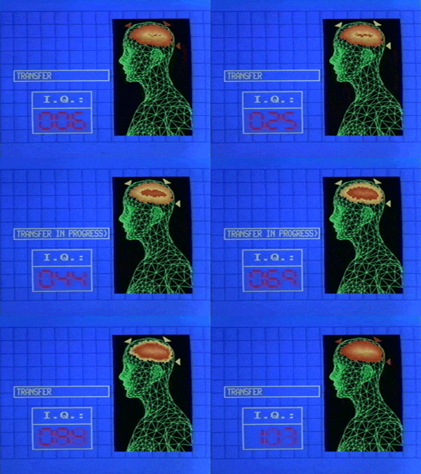
The Mannequin is a term I’m using for the smooth, bald, human figure so popular in sci-fi art. I couldn’t find any sources on the origin of this icon, but it’s become very imporant to the ethos of this aesthetic.
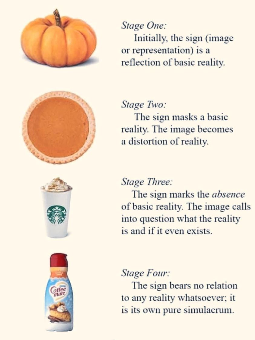
There is a certain “default” humanness about The Mannequin that makes him even less human. He is not human enough, perhaps. He is representational only - an icon of science fiction that removes real human characteristic from the picture. This icon, therefore, serves this work perfectly. One might place the mannequin in stage three of the basic semiotics phases when compared to a real, living human.
![]()
![]()
![]()
![]()
![]()
![]()
The Mannequin
The Mannequin is a term I’m using for the smooth, bald, human figure so popular in sci-fi art. I couldn’t find any sources on the origin of this icon, but it’s become very imporant to the ethos of this aesthetic.
There is a certain “default” humanness about The Mannequin that makes him even less human. He is not human enough, perhaps. He is representational only - an icon of science fiction that removes real human characteristic from the picture. This icon, therefore, serves this work perfectly. One might place the mannequin in stage three of the basic semiotics phases when compared to a real, living human.



TYPOGRAPHY

Type for this project is inspired by the classics.
A combination of 1970s NASA branding, Kubrick’s 2001: A Space Odyssey, and old broadcast television animations come together to inspire these typographical choices. It was important to make sure the look & feel of this work was retrofuturistic.


2001: A Space Odyssey Screens, 1968
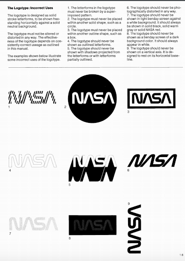
NASA Graphics Standards Manual, 1976
COLOR

Color is based on 100% RBG values, to optimise retro compatibility. Loose “rainbow” upholds Spectrum aesthetic.
AUDIO & VISUAL
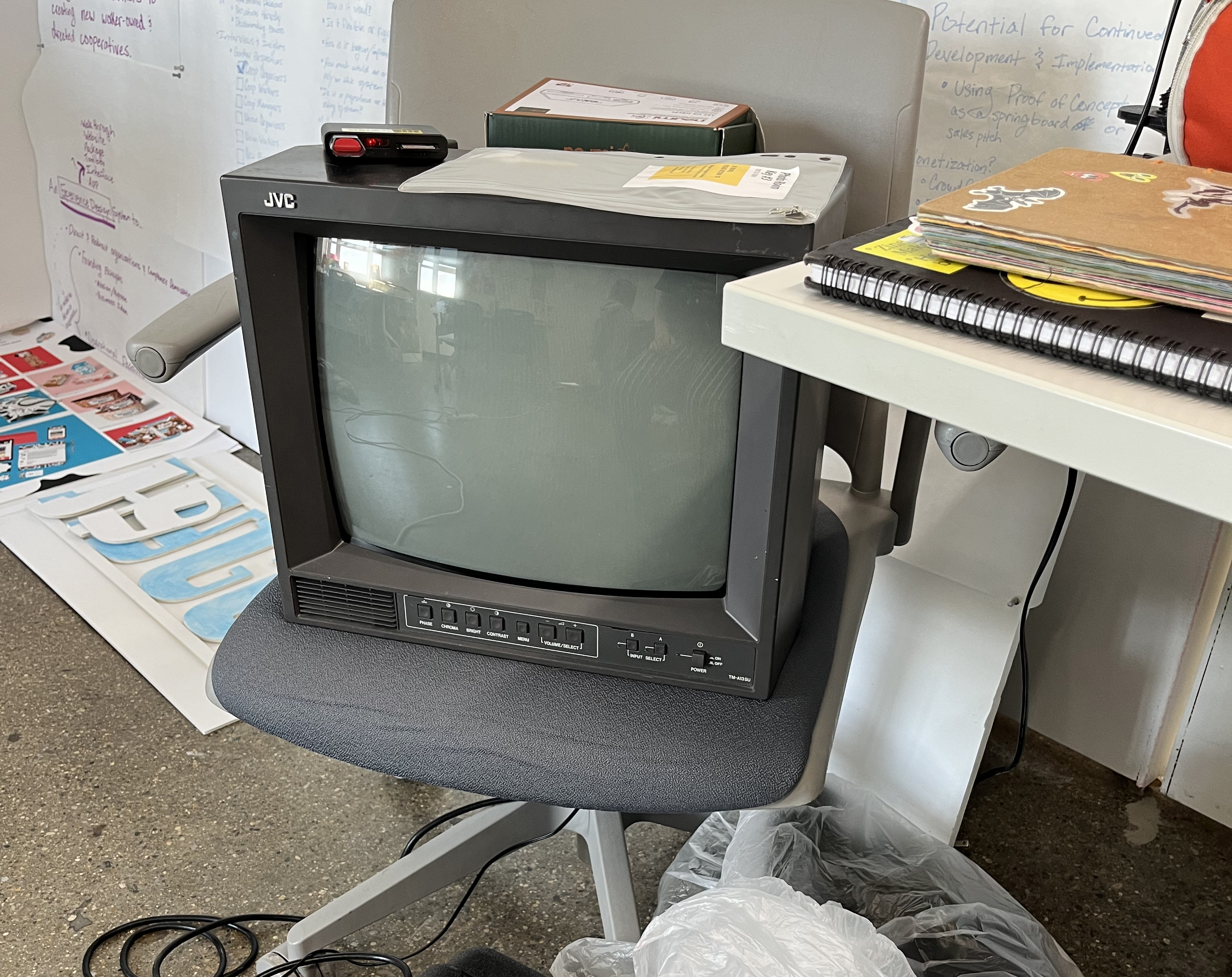
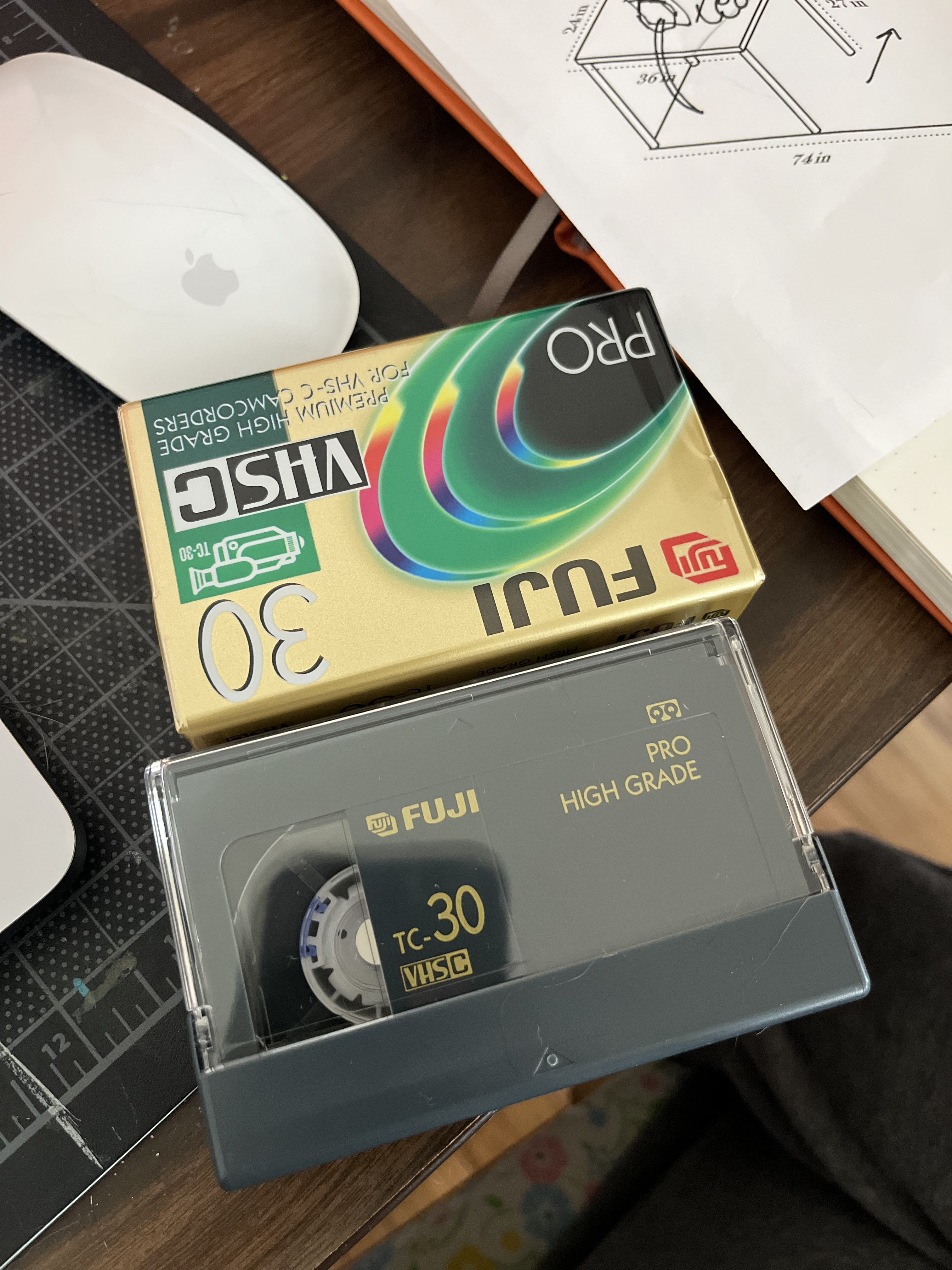
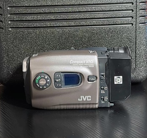 To stay true to the genre, portions are filmed on this JVC VHS-C camcorder.
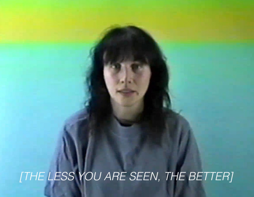

Some of the “actors” within this work are AI. Can you tell who is real and who is fake?

The text-to-speech voiceover you hear is an original from one of the first microsoft programs.
NICHE AESTHETICS & RELEVANT SUBGENRES
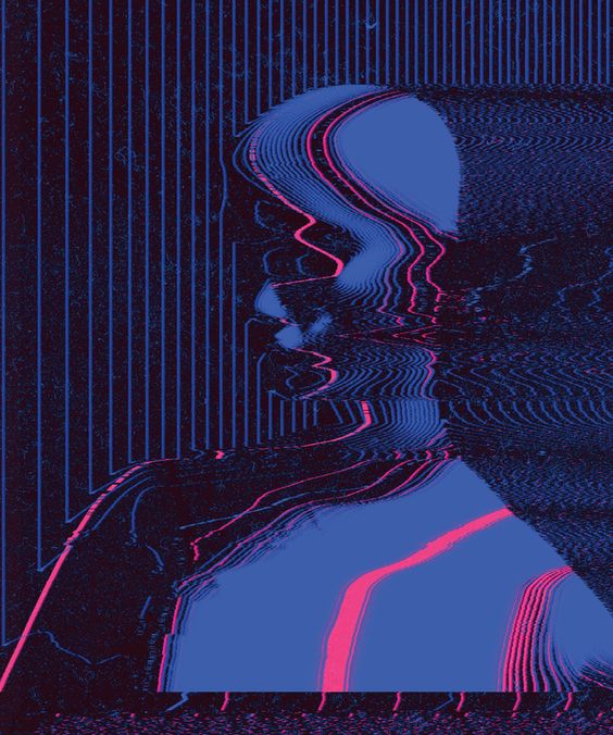
A strict study of certain underground aesthetics also helped inform the look of this project.Glitch Art
![]()
![]()
![]()
![]()

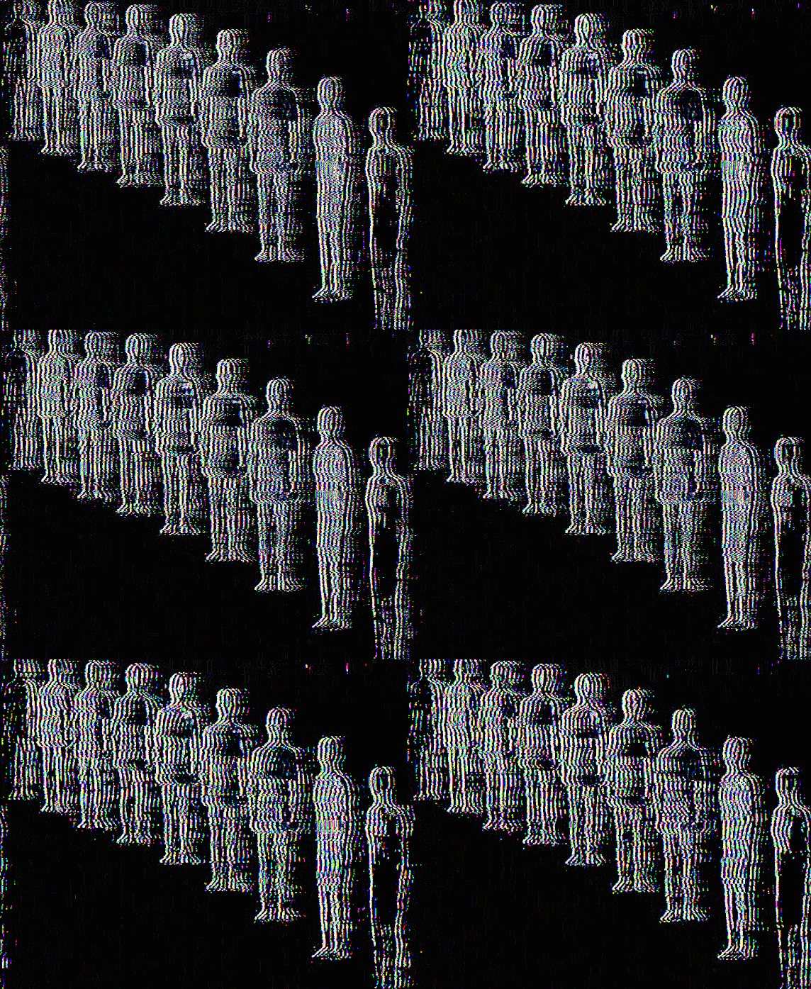

Spacecore
![]()
![]()
![]()
Weirdcore
![]()
![]()
![]()
![]()


CONCLUSIONS
Why does this brand of content exist?
Informed answer: It’s all rooted in nostalgia, a rebirthed fear of modern tech, and the human need for creative storytelling.
It began with the chain email. ARGs. The marketing campaign for the Blair Witch Project, creepypastas, the Y2K bug. It’s the rebirth of oral legend as digital. It’s the fear of the unknown spread globally. This is how we share our myths. These are the legends of the 21st century. This stuff is made real by the people who participate.
The magic of internet horror is that some of its real and some of its fake. The imposed threat of a spooky chain text or an especially scary story or video is not a real threat. Right?This is what makes us feel unsettled and moved by this type of content. It’s a brand-new take on the fear of the unknown.
No, Spectrum Corp is not real. But, without context, could anyone be convinced? Sure, the likelihood of these narratives being true is low. We know this as internet users. However, isn’t the lack of confirmation scarier? The uncertainness that this could be true, somewhere, somehow? I chose the analog horror style because it becomes even harder to nail down the reality of it all. We’re fudging the time frame. Just as the uncanny valley proves, we are hopelessly afraid of ambiguity.
Really, this stuff is about the loosening grip on our realties.I found during my research on internet horror, uncanny strangeness, and liminal spaces that a lot of young people have loads of examples. In fact, I was flooded with examples, my peers eager to share what content stuck with them through the years. This topic resonates heavily with the people who have experienced it.
Why does this matter to young people?
This brings up something interesting about the internet generation as they grow into adults. We begin to have nostalgia for these types of analog, childlike spaces. It reminds us of what used to scare us, and maybe that’s it’s own type of nostalgia.There’s something about our childhood comforts becoming old, dark, and abandoned. The liminality, the literal transition of what used to bring us life and comfort becoming devoid is unsettling for us. This imagery begs to invoke comfort and joy. We become confused, as it doesn’t look quite the same as we remember. There’s something wrong about it. It’s the stuff of our childhood nightmares.
 Five Nights at Freddy’s, Video game, 2004
Skinamarink, Film, 2022
Really, this spans Gen Z’s entire history. Internet horror began no earlier than the mid-90s - we’ve lived our entire internet lives with access to this content. Our need to be creative in online spaces is full & alive. This should be celebrated, and I’ve had the great honor of participating in this niche artistic space. So much can be learned by the way we tell and share stories, especially on a mass level.
PROCESS! PROCESS! PROCESS! PROCESS! process!


